Apr 27, 2023
Version 1
Workflow for beta-range forest plots, bootstrap ridgeline plots, and bootstrap violin plots V.1
- Jonathan Fries1,
- Sandra Oberleiter1,
- Jakob Pietschnig1
- 1Department of Developmental and Educational Psychology, Faculty of Psychology, University of Vienna


Protocol Citation: Jonathan Fries, Sandra Oberleiter, Jakob Pietschnig 2023. Workflow for beta-range forest plots, bootstrap ridgeline plots, and bootstrap violin plots. protocols.io https://dx.doi.org/10.17504/protocols.io.5qpvorz4dv4o/v1
License: This is an open access protocol distributed under the terms of the Creative Commons Attribution License, which permits unrestricted use, distribution, and reproduction in any medium, provided the original author and source are credited
Protocol status: Working
We use this protocol and it's working.
Created: April 27, 2023
Last Modified: April 27, 2023
Protocol Integer ID: 81088
Keywords: visualization, innovative visualization, range forest plot, violin plots regression, bootstrap ridgeline plot, representations of regression result, regression result, regression model, single plot, screening model, regression coefficients in table, models in the selection stage, simulated data, large number of regression model, reporting result, regression coefficient, data, reporting results in research paper, screening
Abstract
Regression is a widely used statistical method in various research areas, such as educational psychology, and it is common to display regression coefficients in tables. Although tables contain dense information, they can be difficult to read and interpret when they are extensive. To address this issue, we present three innovative visualizations that enable researchers to present a large number of regression models in a single plot. We demonstrate how to transform simulated data and plot the results, which produce visually appealing representations of regression results that are both efficient and intuitive. These visualizations can be applied for screening models in the selection stage or reporting results in research papers. Our method is reproducible using the provided code and can be implemented using free and open-source software routines in R.
Guidelines
Get R:
The statistical programming environment can be downloaded free-of-charge at https://cran.r-project.org.
Materials
Troubleshooting
Packages
The following workflow requires the statistical programming environment R (at least version 4.2.2). Before running any command prompts, some packages need to be installed. To this end, we create a vector that contains the respective package names and run a for loop that only installs packages that are not already installed.
required_packages <- c("boot", "broom", "car", "colorspace", "data.table", "faux", "ggcorrplot", "ggplot2", "ggridges", "JWileymisc", "MASS", "psych")
for(i in required_packages){
package_temp <- i
if(!package_temp %in% installed.packages()) {
install.packages(package_temp)
}
}
Next, we load the required packages.
library(boot)
library(broom)
library(car)
library(colorspace)
library(data.table)
library(faux)
library(ggcorrplot)
library(ggplot2)
library(ggridges)
library(JWileymisc)
library(MASS)
library(psych)
Custom functions
To demonstrate the new data visualization techniques, we simulate data. For this purpose, some custom functions are defined beforehand.
# Function for generating plausible results for further events that correlate with performance in the first event #
generate_results <- function(x, ll = -Inf, ul = Inf, runif.min = 0.1, runif.max = 0.5) {
temp <- jitter(x, amount = runif(1, min=runif.min, max=runif.max))
temp_2 <-
ifelse(
temp < ll,
ll + runif(length(x), min=runif.min, max=runif.max),
temp)
temp_3 <-
ifelse(
temp_2 > ul,
ul - runif(length(x), min=runif.min, max=runif.max),
temp_2)
return(temp_3)
}
# Function for truncating results to stay within reasonable boundaries #
truncate_results <- function(x, ll = -Inf, ul = Inf, runif.min = 0.1, runif.max = 0.5) {
temp_1 <-
ifelse(
x < ll,
ll + runif(length(x), min=runif.min, max=runif.max),
x)
temp_2 <-
ifelse(
temp_1 > ul,
ul - runif(length(x), min=runif.min, max=runif.max),
temp_1)
return(temp_2)
}
Data simulation
Now, we begin the data simulation process.
A random seed is defined first; this step ensures that the results are exactly replicable. If replicability is of no concern, this command may be removed.
set.seed(239)
We create a dataframe that contains names and distribution parameters for the variables that we intend to simulate. Here, we chose to demonstrate our method using a fictional dataset of decathlon results. Decathlon is a combination athletics discipline. Over the course of two days, each athlete competes in ten track and field events (100 meters race, long jump, shot-put, high jump, 400 meters race, 110 meters hurdles, discus, pole-vault, javelin, and 1500 meters race).
decathlon_pars <-
data.frame(
discipline =
factor(
c(
"hundred_m",
"long_jump",
"shot_put",
"high_jump",
"four_h_metres",
"one_ten_meters_hurdles",
"discus_throw",
"pole_vault",
"javelin_throw",
"one_five_k_meters")
),
ll = c(10.23, 6.62, 12.81, 1.88, 45.02, 13.46, 39.02, 4.61, 50.64, 4.17),
ul = c(11.32, 8.25, 14.52, 2.01, 51.02, 16.11, 49.34, 5.20, 63.63, 5.03),
mean = c(10.78, 7.42, 13.66, 1.95, 48.00, 14.78, 44.17, 4.90, 57.13, 4.60),
sd = c(0.36, 0.54, 0.57, 0.04, 1.98, 0.87, 3.41, 0.21, 4.29, 0.28)
)
The simulated decathlon results are expected to be intercorrelated. Thus, we define a matrix of correlations between the variables that we intend to simulate and convert it to a covariance matrix.
cov_mat <-
JWileymisc::cor2cov(
V = rbind(
c(1, 0.5, 0.3, 0.6, 0.6, 0.5, 0.6, 0.5, 0.4, 0.7),
c(0.5, 1, 0.3, 0.6, 0.5, 0.5, 0.4, 0.6, 0.4, 0.5),
c(0.3, 0.3, 1, 0.4, 0.4, 0.5, 0.7, 0.3, 0.6, 0.4),
c(0.6, 0.6, 0.4, 1, 0.4, 0.5, 0.3, 0.6, 0.4, 0.5),
c(0.6, 0.5, 0.4, 0.4, 1, 0.7, 0.5, 0.6, 0.5, 0.7),
c(0.5, 0.5, 0.5, 0.5, 0.7, 1, 0.4, 0.5, 0.4, 0.7),
c(0.6, 0.4, 0.7, 0.3, 0.5, 0.4, 1, 0.5, 0.7, 0.4),
c(0.5, 0.6, 0.3, 0.6, 0.6, 0.5, 0.5, 1, 0.7, 0.5),
c(0.4, 0.4, 0.6, 0.4, 0.5, 0.4, 0.7, 0.7, 1, 0.4),
c(0.7, 0.5, 0.4, 0.5, 0.7, 0.7, 0.4, 0.5, 0.4, 1)
),
sigma = decathlon_pars$sd
)
Using this covariance matrix, we now generate correlated decathlon results for 10,000 fictional athletes
# Generate correlated decathlon results for 10,000 athletes #
decathlon_results <-
setDT(
as.data.frame(
mvrnorm(
n=10000,
mu=decathlon_pars$mean,
Sigma= cov_mat,
)
)
)
# Rename variables #
colnames(decathlon_results) <-
c(
"hundred_m_01",
"long_jump_01",
"shot_put_01",
"high_jump_01",
"four_h_metres_01",
"one_ten_meters_hurdles_01",
"discus_throw_01",
"pole_vault_01",
"javelin_throw_01",
"one_five_k_meters_01"
)
Some of the generated values are outside the range of human physical capability. To address this, we truncate the results to stay within reasonable boundaries. A custom function is applied within a for loop.
for (i in decathlon_pars$discipline){
disc_name <- paste0(i, "_01")
pars_temp <-
subset(
decathlon_pars,
discipline %in% paste0(i))
decathlon_results[[disc_name]] <- truncate_results(
decathlon_results[[disc_name]],
ll = pars_temp$ll,
ul = pars_temp$ul,
runif.min = jitter(pars_temp$sd*0.2, amount=pars_temp$sd*0.1),
runif.max = jitter(pars_temp$sd*0.4, amount=pars_temp$sd*0.1))
}
We now have one data point for each decathlon discipline for each of the 10,000 fictional athletes. However, we aim to simulate 4 additional data points for each athlete. We use a custom function that was defined above (section "Custom functions") within a for for loop to simulate additional observations. This results in 5 data points in each decathlon sub-discipline for each athlete.
for (i in decathlon_pars$discipline){
disc_name <- paste0(i, "_01")
pars_temp <-
subset(
decathlon_pars,
discipline %in% paste0(i))
result_2 <-
generate_results(
decathlon_results[[disc_name]],
ll = pars_temp$ll,
ul = pars_temp$ul,
runif.min = jitter(pars_temp$sd*0.2, amount=pars_temp$sd*0.1),
runif.max = jitter(pars_temp$sd*0.4, amount=pars_temp$sd*0.1)
)
result_3 <-
generate_results(
decathlon_results[[disc_name]],
ll = pars_temp$ll,
ul = pars_temp$ul,
runif.min = jitter(pars_temp$sd*0.2, amount=pars_temp$sd*0.1),
runif.max = jitter(pars_temp$sd*0.4, amount=pars_temp$sd*0.1)
)
result_4 <-
generate_results(
decathlon_results[[disc_name]],
ll = pars_temp$ll,
ul = pars_temp$ul,
runif.min = jitter(pars_temp$sd*0.2, amount=pars_temp$sd*0.1),
runif.max = jitter(pars_temp$sd*0.4, amount=pars_temp$sd*0.1)
)
result_5 <-
generate_results(
decathlon_results[[disc_name]],
ll = pars_temp$ll,
ul = pars_temp$ul,
runif.min = jitter(pars_temp$sd*0.2, amount=pars_temp$sd*0.1),
runif.max = jitter(pars_temp$sd*0.4, amount=pars_temp$sd*0.1)
)
decathlon_results <-
cbind(
decathlon_results,
result_2,
result_3,
result_4,
result_5
)
setnames(
decathlon_results,
old = c("result_2", "result_3", "result_4", "result_5"),
new = c(paste0(i, "_02"), paste0(i, "_03"), paste0(i, "_04"), paste0(i, "_05"))
)
}
Simulation of athletics results is now completed. Next, some predictors are needed. We chose to use fictional data of seven hematological indices (ferritin, haptoglobin, hematocrit, hemoglobin, iron, red blood cell count, and transferrin) that have been demonstrated to be associated with sports performance. For each hematological index, we simulate normally distributed data that exhibit pre-defined correlations with some of the decathlon events.
decathlon_results$hemoglobin <-
rnorm_pre(
subset(
decathlon_results,
select=c(
hundred_m_01,
long_jump_01,
shot_put_01
)
),
mu = 15.9,
sd = 1.1,
r = c(0.6, 0.5, 0.4),
empirical = FALSE
)
decathlon_results$rb_cell <-
rnorm_pre(
subset(
decathlon_results,
select=c(
discus_throw_01,
pole_vault_01,
javelin_throw_01,
hemoglobin
)
),
mu = 5.24,
sd = 0.52,
r = c(0.55, 0.45, 0.4, 0.6),
empirical = FALSE
)
decathlon_results$iron <-
rnorm_pre(
subset(
decathlon_results,
select=c(
discus_throw_01,
pole_vault_01,
javelin_throw_01,
rb_cell
)
),
mu = 122.5,
sd = 10.5,
r = c(0.6, 0.5, 0.4, 0.7),
empirical = FALSE
)
decathlon_results$hematocrit <-
rnorm_pre(
subset(
decathlon_results,
select=c(
high_jump_01,
four_h_metres_01,
one_ten_meters_hurdles_01,
hemoglobin
)
),
mu = 46.8,
sd = 2.7,
r = c(0.6, 0.5, 0.4, 0.7),
empirical = FALSE
)
decathlon_results$ferritin <-
rnorm_pre(
subset(
decathlon_results,
select=c(
one_five_k_meters_01,
one_ten_meters_hurdles_01,
hundred_m_01,
iron
)
),
mu = 68.3,
sd = 8.9,
r = c(0.6, 0.5, 0.4, 0.7),
empirical = FALSE
)
decathlon_results$haptoglobin <-
rnorm_pre(
subset(
decathlon_results,
select=c(
high_jump_01,
four_h_metres_01,
one_ten_meters_hurdles_01,
hemoglobin
)
),
mu = 65.7,
sd = 9.3,
r = c(0.3, 0.2, 0.3, 0.25),
empirical = TRUE
)
decathlon_results$transferrin <-
rnorm_pre(
subset(
decathlon_results,
select=c(
long_jump_01,
high_jump_01,
pole_vault_01,
hemoglobin
)
),
mu = 321,
sd = 40.9,
r = c(0.3, 0.2, 0.3, 0.25),
empirical = FALSE
)
Data simulation is complete. To tidy up the data, we re-order the dataframe columns.
decathlon_results <-
decathlon_results[,
c(
"hundred_m_01", "hundred_m_02", "hundred_m_03", "hundred_m_04", "hundred_m_05",
"long_jump_01", "long_jump_02", "long_jump_03", "long_jump_04", "long_jump_05",
"shot_put_01", "shot_put_02", "shot_put_03", "shot_put_04", "shot_put_05",
"high_jump_01", "high_jump_02", "high_jump_03", "high_jump_04", "high_jump_05",
"four_h_metres_01", "four_h_metres_02", "four_h_metres_03", "four_h_metres_04", "four_h_metres_05",
"one_ten_meters_hurdles_01", "one_ten_meters_hurdles_02", "one_ten_meters_hurdles_03", "one_ten_meters_hurdles_04", "one_ten_meters_hurdles_05",
"discus_throw_01", "discus_throw_02", "discus_throw_03", "discus_throw_04", "discus_throw_05",
"pole_vault_01", "pole_vault_02", "pole_vault_03", "pole_vault_04", "pole_vault_05",
"javelin_throw_01", "javelin_throw_02", "javelin_throw_03", "javelin_throw_04", "javelin_throw_05",
"one_five_k_meters_01", "one_five_k_meters_02", "one_five_k_meters_03", "one_five_k_meters_04", "one_five_k_meters_05",
"ferritin",
"haptoglobin",
"hematocrit",
"hemoglobin",
"iron",
"rb_cell",
"transferrin"
)
]
To visualize the correlation structure of the dataframe, we create a (Pearson) correlation heatmap of all variables.
heatmap_decathlon <-
ggcorrplot(
cor(
decathlon_results,
method="pearson",
use="complete.obs"),
method="square",
hc.order = FALSE,
type = "lower",
lab = F,
lab_size=2,
digits=2,
p.mat=corr.p(
r=corr.test(
decathlon_results,
method="spearman",
use="complete")$r,
n=10000,
adjust="none",
minlength=5
)$p
)
Heatmap of Pearson correlation coefficients between all variables in the generated decathlon dataset.
Regression
Next, we intend to predict decathlon outcomes from hematological indices. We model these relationships using a single-predictor linear regression framework.
The dataset needs to be converted to long format. The conversion is carried out using the melt command from the data.table package.
decathlon_results_long <- melt(decathlon_results,
id.vars = c("ferritin","haptoglobin", "hematocrit", "hemoglobin", "iron", "rb_cell", "transferrin"),
variable.name = "outcome",
value.name = "result")
decathlon_results_long <- melt(decathlon_results_long,
id.vars = c("outcome", "result"),
measure.vars = c("ferritin","haptoglobin", "hematocrit", "hemoglobin", "iron", "rb_cell", "transferrin"),
variable.name = "predictor", "pred_value")
Now, we run regressions in batch using data.table, resulting in 350 regression models stored in a separate dataframe.
models_decathlon <-
decathlon_results_long[,
.(
estimate =
tidy(
summary(
lm(
scale(result) ~ scale(pred_value))))$estimate[2],
se =
tidy(
summary(
lm(
scale(result) ~ scale(pred_value))))$std.error[2],
statistic =
tidy(
summary(
lm(
scale(result) ~ scale(pred_value))))$statistic[2],
p =
tidy(
summary(
lm(
scale(result) ~ scale(pred_value))))$p.value[2],
eta.sq =
summary(
lm(
scale(result) ~ scale(pred_value)))$r.squared[1],
ll =
tidy(
summary(
lm(
scale(result) ~ scale(pred_value))))$estimate[2] -
1.96*tidy(summary(lm(
scale(result) ~ scale(pred_value))))$std.error[2],
ul =
tidy(
summary(
lm(
scale(result) ~ scale(pred_value))))$estimate[2] +
1.96*tidy(summary(lm(
scale(result) ~ scale(pred_value))))$std.error[2]
),
by = .(predictor, outcome)]
Data visualization
Before we can visualize the regression models, some data modifications are necessary. Using standard visualization approaches, it would be next to impossible to create an efficient plot for such a large number of models. Here, we achieve this by summarizing the regression results as follows.
First, we create a variable that allocates all five models for each discipline into one category (e.g., "hundred_m_01", ..., "hundred_m_05" are put in the category "hundred_m". This category variable is named "domain".
models_decathlon$domain <-
as.factor(
gsub(
"(_+[0-9]+[0-9])",
"",
models_decathlon$outcome)
)
Next, we create a dataframe that contains the lower and upper limits of the point estimate range for each domain category, as well as outer limits of the confidence intervals. An empty (container) dataframe is created to which we add the desired parameters. Subsequently, the new dataframe is tidied up.
# Create container dataframe (necessary for adding parameters in each iteration of the following loop) #
linerange_table_decathlon <-
setDT(
data.frame(
ll_estimate = 0,
ul_estimate = 0,
ll_ci = 0,
ul_ci = 0,
domain = 0,
predictor = 0)
)
# Create a dataframe that contains lower/upper limits of point estimate range for each domain category, as well as outer limits of the CI's #
for (j in levels(models_decathlon$predictor)){
predictor_name <- paste0(j)
dat_temp <-
subset(
models_decathlon,
predictor %in% predictor_name
)
for (i in levels(models_decathlon$domain)){
domain_name <- paste0(i)
dat_temp.2 <-
subset(
dat_temp,
domain %in% domain_name)
ll_estimate <- min(dat_temp.2$estimate)
ul_estimate <- max(dat_temp.2$estimate)
ll_ci <- min(dat_temp.2$ll)
ul_ci <- max(dat_temp.2$ul)
linerange_temp_table <-
data.frame(
ll_estimate,
ul_estimate,
ll_ci,
ul_ci,
domain = as.factor(domain_name),
predictor = as.factor(predictor_name)
)
linerange_table_decathlon <-
rbind(
linerange_table_decathlon,
linerange_temp_table
)
}
rm(predictor_name, dat_temp, domain_name, dat_temp.2, ll_estimate, ul_estimate, ll_ci, ul_ci, linerange_temp_table)
}
# Remove empty first row of dataframe #
linerange_table_decathlon <- linerange_table_decathlon[-1,]
# Drop unused factor levels #
linerange_table_decathlon$domain <- droplevels(linerange_table_decathlon$domain)
linerange_table_decathlon$predictor <- droplevels(linerange_table_decathlon$predictor)
The forest plot modifications we will produce in the following steps feature a coordinate system that is flipped clockwise. This requires the factor levels of some variables to be reversed to ensure they are correctly displayed in the final plot.
# Reordering factor levels for 'domain' for correct display in plot #
linerange_table_decathlon$domain <-
factor(linerange_table_decathlon$domain,
levels=c(
"hundred_m",
"long_jump",
"shot_put",
"high_jump",
"four_h_metres",
"one_ten_meters_hurdles",
"discus_throw",
"pole_vault",
"javelin_throw",
"one_five_k_meters"
)
)
# Reversing order of factor levels for 'predictor' for correct display in flipped coordinate system in ggplot #
linerange_table_decathlon$predictor <-
factor(linerange_table_decathlon$predictor, levels = rev(levels(linerange_table_decathlon$predictor)))
Before plotting, some text settings (ggplot) are defined that we will use for all plots.
text_settings <-
element_text(
colour="black",
size=10,
face="bold"
)
All necessary data modifications are complete. We now create the beta-range forest plot.
brf_plot <-
ggplot(data = linerange_table_decathlon, aes(x = predictor, color = domain)) +
geom_hline(yintercept = 0, lty = 1, size = 1.5, color = "#E73134") +
geom_hline(yintercept = 0.1, lty = "dotted", size = 0.6, color = "black") +
geom_hline(yintercept = 0.3, lty = "dotted", size = 0.6, color = "black") +
geom_hline(yintercept = 0.5, lty = "dotted", size = 0.6, color = "black") +
geom_linerange(
aes(ymin = ll_estimate, ymax = ul_estimate),
linewidth= 5,
position = position_dodge(width = 0.5)) +
geom_errorbar(
aes(ymin = ll_ci, ymax = ul_ci),
linetype = "solid",
width = 2,
size = 1,
position = position_dodge(width=0.5)) +
coord_flip() +
ylab("Linear regression coefficients") +
xlab("") +
ggtitle("") +
theme_classic() +
theme(
legend.background = element_rect(fill = "lightgrey", colour = "black", linewidth = 0.8),
panel.grid.major.y = element_line(linewidth = 1, linetype = "solid", color = "darkgrey"),
axis.title.y = element_blank(),
panel.border = element_rect(colour = "black", fill = NA, linewidth = 1),
panel.background = element_rect(fill = 'lightgrey'),
legend.position = "right",
axis.text.y = text_settings,
axis.text.x = text_settings,
axis.title.x = text_settings,
legend.text = text_settings,
legend.title = text_settings) +
scale_color_manual(
values = divergingx_hcl(length(levels(linerange_table_decathlon$domain)), palette = "Spectral"),
name = "Outcome",
breaks = rev(levels(linerange_table_decathlon$domain)),
labels =
c(
"hundred_m" = "100 meters",
"long_jump" = "Long jump",
"shot_put" = "Shot put",
"high_jump" = "High jump",
"four_h_metres" = "400 metres",
"one_ten_meters_hurdles" = "110 meters hurdles",
"discus_throw" = "Discus throw",
"pole_vault" = "Pole vault",
"javelin_throw" = "Javelin throw",
"one_five_k_meters" = "1500 meters")) +
scale_x_discrete(
labels=c(
"hematocrit" = "Hematocrit",
"hemoglobin" = "Hemoglobin",
"rb_cell" = "Red blood cell count",
"iron" = "Iron",
"transferrin" = "Transferrin",
"ferritin" = "Ferritin",
"haptoglobin" = "Haptoglobin")) +
scale_y_continuous(breaks = c(0, 0.1, 0.2, 0.3, 0.4, 0.5, 0.6))
Beta-range forest plot for simulated decathlon data.
This data visualization relies on boxplot-like indicators for point estimate ranges as well as confidence interval ranges. An alternative approach to visualizing regression models is to plot the bootstrapped distributions of point estimates.
Thus, bootstrapped data points are required for each regression model. We begin by setting a random seed. As above, this step may be skipped.
set.seed(626)
Next, we define a helper function for computing bootstrap estimates (returns point estimates of linear regression models).
boot_function <-
function(formula, data, indices) {
d <- data[indices,]
fit <- lm(formula, data=d)
return(tidy(fit)$estimate[2])
}
Bootstrap estimates are computed using a for loop and added to empty container dataframe. CAUTION: this computation is fairly lengthy, thus protected by hashes. If you wish to forgo computation of the bootstrap estimates, skip this step and directly import the dataset of bootstrapped parameter estimates (found in "Materials").
# Create container data.table for bootstrap parameter estimates #
boot_df <-
as.data.table(
data.frame(
V1 = 0,
predictor = 0,
outcome = 0
))
# Compute bootstrap parameter estimates #
for(i in 1:nrow(models_decathlon)){
orig_model_temp <- models_decathlon[i,] predictor_temp <- orig_model_temp$predictor
outcome_temp <- orig_model_temp$outcome
formula_temp <- as.formula(
paste0(
"scale(",
outcome_temp,
")",
"~",
"scale(", predictor_temp,
")"))
boot_temp <- boot(data = decathlon_results, boot_function, R=500, formula = formula_temp)
boot_temp_df <- as.data.table(boot_temp$t)
boot_temp_df$predictor <- predictor_temp
boot_temp_df$outcome <- outcome_temp
boot_df <- rbind(
boot_df,
boot_temp_df
)
rm(orig_model_temp, predictor_temp, outcome_temp, formula_temp, boot_temp, boot_temp_df)
}
# Remove first row of dataframe #
boot_df <- boot_df[-1,]
# Rename 'V1' to 'estimate'
names(boot_df)[names(boot_df) == "V1"] <- "estimate"
If you wish to skip the computation of bootstrapped parameter estimates, the dataset can be directly imported. The file "S2_file.xlsx" can be found in "Materials".
boot_df <- read_xlsx("/your_path_here/S2_file.xlsx")
Analogous to the step 5.1, we create a category variable named "domain".
boot_df$domain <-
factor(
gsub(
"(_+[0-9]+[0-9])",
"",
boot_df$outcome),
levels = c(
"hundred_m",
"long_jump",
"shot_put",
"high_jump",
"four_h_metres",
"one_ten_meters_hurdles",
"discus_throw",
"pole_vault",
"javelin_throw",
"one_five_k_meters"))
The variable "predictor" needs to be converted to a factor.
boot_df$predictor <-
factor(
boot_df$predictor)
Analogous to Step 5.3, factor levels need to be reversed for correct display in the plot.
boot_df$domain_rev <-
factor(
boot_df$domain,
levels = rev(levels(boot_df$domain)))
boot_df$predictor_rev <-
factor(
boot_df$predictor,
levels = rev(levels(boot_df$predictor)))
Now, all preparatory computations are complete and the data is ready for plotting. We create a bootstrap ridgeline plot for all 350 regression models.
boot_ridgeplot <-
ggplot(boot_df, aes(x = estimate, y = predictor_rev, fill = domain)) +
geom_vline(xintercept = 0, lty = 1, linewidth = 1.5, color = "#E73134") +
geom_vline(xintercept = 0.1, lty = "dotted", linewidth = 1, color = "black") +
geom_vline(xintercept = 0.3, lty = "dotted", linewidth = 1, color = "black") +
geom_vline(xintercept = 0.5, lty = "dotted", linewidth = 1, color = "black") +
geom_density_ridges(scale = 0.9, rel_min_height = 0.0001, color = NA, alpha = .8)+
xlab("Linear regression coefficients") +
ylab("") +
ggtitle("") +
theme_classic() +
theme(
legend.background = element_rect(fill = "lightgrey", colour = "black", linewidth = 0.8),
panel.grid.major.y = element_line(size = 1, linetype = "solid", color = "darkgrey"),
axis.title.y = element_blank(),
panel.border = element_rect(colour = "black", fill = NA, linewidth = 1),
panel.background = element_rect(fill = 'lightgrey'),
legend.position = "right",
axis.text.y = text_settings,
axis.text.x = text_settings,
axis.title.x = text_settings,
legend.text = text_settings,
legend.title = text_settings) +
scale_fill_manual(
values = divergingx_hcl(length(levels(boot_df$domain)), palette = "Spectral"),
name = "Outcome",
labels =
c(
"hundred_m" = "100 meters",
"long_jump" = "Long jump",
"shot_put" = "Shot put",
"high_jump" = "High jump",
"four_h_metres" = "400 metres",
"one_ten_meters_hurdles" = "110 meters hurdles",
"discus_throw" = "Discus throw",
"pole_vault" = "Pole vault",
"javelin_throw" = "Javelin throw",
"one_five_k_meters" = "1500 meters")) +
scale_y_discrete(
labels=c(
"hematocrit" = "Hematocrit",
"hemoglobin" = "Hemoglobin",
"rb_cell" = "Red blood cell count",
"iron" = "Iron",
"transferrin" = "Transferrin",
"ferritin" = "Ferritin",
"haptoglobin" = "Haptoglobin")) +
scale_x_continuous(breaks = c(-0.1, 0, 0.1, 0.2, 0.3, 0.4, 0.5, 0.6))
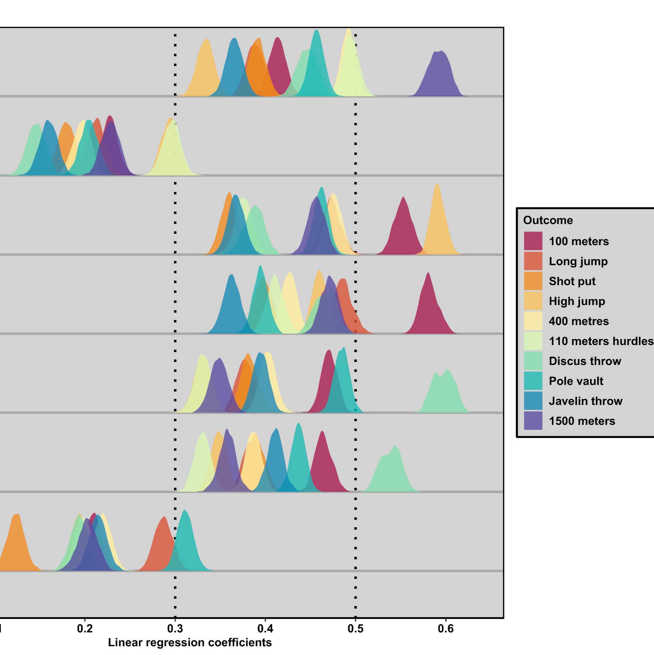
Bootstrap ridgeline plot, displaying miniature density plots of 500 parameter estimates for each decathlon regression model.
To address the issue of overlapping density plots, we developed an alternative representation of the distributions of bootstrapped beta coefficients by making use of the violin plot. To create a bootstrap violin plot, the bootstrap dataset from before can be used without modifications.
boot_violinplot <-
ggplot(boot_df, aes(x = estimate, y = predictor_rev, fill = domain)) +
geom_vline(xintercept = 0, lty = 1, linewidth = 1.5, color = "#E73134") +
geom_vline(xintercept = 0.1, lty = "dotted", linewidth = 1, color = "black") +
geom_vline(xintercept = 0.3, lty = "dotted", linewidth = 1, color = "black") +
geom_vline(xintercept = 0.5, lty = "dotted", linewidth = 1, color = "black") +
geom_violin(scale = 3, color = NA, alpha = 1, position = position_dodge(width = 0.5))+
xlab("Linear regression coefficients") +
ylab("") +
ggtitle("") +
theme_classic() +
theme(
legend.background = element_rect(fill = "lightgrey", colour = "black", linewidth = 0.8),
panel.grid.major.y = element_line(size = 1, linetype = "solid", color = "darkgrey"),
axis.title.y = element_blank(),
panel.border = element_rect(colour = "black", fill = NA, linewidth = 1),
panel.background = element_rect(fill = 'lightgrey'),
legend.position = "right",
axis.text.y = text_settings,
axis.text.x = text_settings,
axis.title.x = text_settings,
legend.text = text_settings,
legend.title = text_settings) +
scale_fill_manual(
values = divergingx_hcl(length(levels(boot_df$domain)), palette = "Spectral"),
name = "Outcome",
labels =
c(
"hundred_m" = "100 meters",
"long_jump" = "Long jump",
"shot_put" = "Shot put",
"high_jump" = "High jump",
"four_h_metres" = "400 metres",
"one_ten_meters_hurdles" = "110 meters hurdles",
"discus_throw" = "Discus throw",
"pole_vault" = "Pole vault",
"javelin_throw" = "Javelin throw",
"one_five_k_meters" = "1500 meters")) +
scale_y_discrete(
labels=c(
"hematocrit" = "Hematocrit",
"hemoglobin" = "Hemoglobin",
"rb_cell" = "Red blood cell count",
"iron" = "Iron",
"transferrin" = "Transferrin",
"ferritin" = "Ferritin",
"haptoglobin" = "Haptoglobin")) +
scale_x_continuous(breaks = c(-0.1, 0, 0.1, 0.2, 0.3, 0.4, 0.5, 0.6))
Bootstrap violin plot, displaying symmetrically mirrored density plots of 500 parameter estimates for each decathlon regression model.
Protocol references
References for R and used packages:
Angelo Canty and Brian Ripley (2022). boot: Bootstrap R (S-Plus) Functions. R package version 1.3-28.1.
Robinson D, Hayes A, Couch S (2022). _broom: Convert Statistical Objects into Tidy Tibbles_. R package version 1.0.1. https://CRAN.R-project.org/package=broom.
John Fox and Sanford Weisberg (2019). An {R} Companion to Applied Regression, Third Edition. Thousand Oaks CA: Sage. URL: https://socialsciences.mcmaster.ca/jfox/Books/Companion/
Zeileis A, Fisher JC, Hornik K, Ihaka R, McWhite CD, Murrell P, Stauffer R, Wilke CO (2020). “colorspace: A Toolbox for Manipulating and Assessing Colors and Palettes.” _Journal of Statistical Software_, *96*(1), 1-49. doi:10.18637/jss.v096.i01 https://doi.org/10.18637/jss.v096.i01
Dowle M, Srinivasan A (2022). data.table: Extension of `data.frame`. (R package version 1.14.4). https://CRAN.R-project.org/package=data.table
Lisa DeBruine, (2021). faux: Simulation for Factorial Designs (R package version 1.1.0). Zenodo. http://doi.org/10.5281/zenodo.2669586
Kassambara, A. (2022). ggcorrplot: Visualization of a Correlation Matrix using 'ggplot2'. R package version
Wickham, H. (2016). ggplot2: Elegant graphics for data analysis. Springer.
R Core Team (2021). R: A language and environment for statistical computing. R Foundation for Statistical Computing, Vienna, Austria. https://www.R-project.org/.
Revelle, W. (2022) psych: Procedures for Personality and Psychological Research, Northwestern University, Evanston, Illinois, USA. https://CRAN.R-project.org/package=psych
Venables, W. N. & Ripley, B. D. (2002) Modern Applied Statistics with S. Fourth Edition. Springer, New York.
Wilke C (2022). _ggridges: Ridgeline Plots in 'ggplot2'_. R package version 0.5.4, https://CRAN.R-project.org/package=ggridges
Wiley J (2022). _JWileymisc: Miscellaneous Utilities and Functions_. R package version 1.3.0.